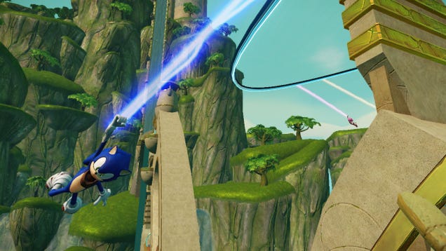
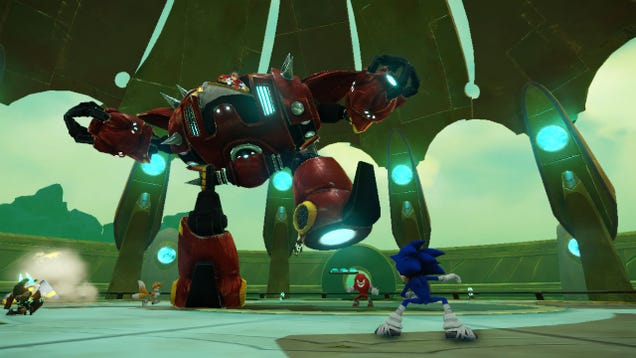
Vor ungefähr drei Wochen durften zahlreiche Journalisten in einem Hotel in Los Angeles vier Levels des kommenden Sonic Boom spielen. Was geboten wurde, war „Spaß für die ganze Familie“: ziemlich leichte Kämpfe, etwas anspruchsvolleres Platforming und ein wenig von dem kultigen „Sonic flitzt durch Ringe“.
Hier sehen Sie Game Fronts Bildmaterial von dem, was damals auf der Wii U spielbar war:
Doch interessanter als das Spielen war das darauf folgende Pressegespräch mit Big Red Button CEO und Creative Director Bob Rafei, in dessen Verlauf vor allem über den blauen Igel (hedgehog) gesprochen wurde, mit dem so viele Gamer groß geworden sind.
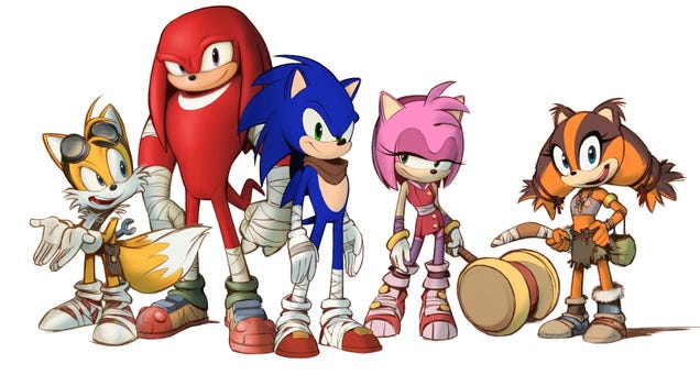
Auf die ersten Bilder von Sonic Booms, die an die Öffentlichkeit kamen, wurde zum Teil mit heftiger Ablehnung reagiert. Sonic wurde von manchen Fans aufgrund seiner langen, dünnen neuen Beine und des scheinbar willkürlichen Taschentuchs als Hipster bezeichnet. Also was war der Grund für diesen neuen Look? Und was dachte das Team, das für diesen verantwortlich zeichnet, über die Aufregung rund um die Ankündigung?
"We wanted the characters to feel a little bit older", erläuterte Rafei in einem Interview. "From a character design perspective, that kind of subtle detail is really important to make the character just feel somewhat different. So, their costume approach...that was something that was collaborated with Sonic team in terms of trying a lot of different routes and the one that you see now is the one that everybody gravitated towards. The wraps are there because it shows that the characters are not vain. They're not so much concerned about their gear, like, for example, Dr. Eggman, who is more of the vain, militaristic-looking guy who wants to have all the pomp and pageantry of that outfit. But they're heroes who, like you see with fighters, with martial artists, or football players who wrap their cleats out of necessity...that was where that came from. That kind of sensibility of these heroes who don't care about their attire, they're just trying to do the thing that they need to do to get through to the action and then their goal.
"The bandana reflects the sense of character adventure. It reflects back on the lone gunman, the cowboy, the rugged individualist. As we were trying to find things that could work for the character, that was one of the things that stuck and we liked it. The rest of Sega felt the same way. So because it reflects that sense of adventure and heroism, we felt it was a good fit."
Die Idee, dass die Ausrüstung und Kleidung der Charaktere in Sonic die Abenteuer und Action reflektieren sollten, die ihnen scheinbar so großen Spaß macht, ist etwas, über das das Entwicklerteam in der Vergangenheit schon mehrmals sprach.
Es war aber nicht das einzige Design, mit dem sie herumexperimentierten. Es ist etwas, über das sie lange berieten und das sie schließlich gemeinsam umsetzten.

"We did a lot of experiments", sagte Rafei. "The Sonic team really gave us the guardrails to experiment within. We eventually found out some of the things that were excessive and ultimately would not have been true to the spirit of what Sonic is. And I'm glad that they actually reigned us in. From an independent developer's perspective and looking at it through the eyes of my kids who, if they were looking at a Sonic title for the first time, what would they want to see? That was something that really just drove the decision-making process from a production/design perspective."
Und was ist mit den Reaktionen? Sehr rasch tauchten reichlich Fankunst und Twitter-Witze auf, die sich allesamt mit Sonics neuem Look befassten.
"It was, the majority, overwhelmingly positive", meinte Rafei. "So I think it validates what we're trying to do. From my perspective, if there wasn't such controversy, or potentially conversation about it, I should say, then we would not have been doing our job. As an independent developer who has been brought into the family to try something different, if it was seen as, 'Oh, it looks like another Sonic title,' then I think I would've failed Sega, personally. So it was really important for us to try something different, to take a different approach, and we'll see where it takes us."
Aber es lässt sich nicht leugnen, dass es viele heftige Streitgespräche über und sehr viele positive, aber auch negative Reaktionen auf den neuen Look gab. War das überwältigend? Überraschend?
"I take it as a highest form of compliment", sagte Rafei. "I wasn't surprised so much as really starting to understand the gravity of such an iconic character and how he has a huge following. When a character's been along for such a long time, people—fans—get that sense of ownership. We had to be true to that, we couldn't just brush it off as developers trying to create their vision. It was a long, methodical process of working with Sonic team and Sega to end up where we are. Very happy with the look and hopefully fans will gravitate towards it."

Rafei sprach viel darüber, dass man sich bemühte, Sonic treu zu bleiben, aber trotzdem eine Identität für ihn zu finden, die allen deutlich macht, dass es sich um einen neuen Titel mit einer neuen Richtung handelt. Welche Bedeutung hat Sonic für das Entwicklerteam?
"Speed", erwiderte er. "His silhouette is very strong, he's very recognizable. He's got a very clean graphic silhouette with his quills. We didn't want to break that too much. We made some slight secondary quill modifications, but that's only because he's going so fast so it's kind of perking up a bit more. But really that's where that comes from. We didn't want to make the character feel so different that he was no longer true to the DNA of it."

 Facebook
 Twitter
 RSS
RSS


0 yorum:
Yorum Gönder